Seesaw Creative Tools
Seesaw’s Creative Tools are a set of multimedia tools that students use in the classroom to create a post about their learning. Currently, a student can post a photo, add labels and a simple drawing on top of it. The creative tools are the core experience of Seesaw, and after years of no changes, in need of an upgrade.
My Role
Lead Product Designer partnering with PM, Engineers, and Leadership. Designed end to end experience, from initial brainstorm to high fidelity mocks. Output includes: web, tablet, mobile mocks.
Responsibilities
Planning
Brainstorming +
Rapid Iteration
Eng Ready Mocks + Prototype
User Research + Testing
Feedback + V2
The Challenge
The Creative Tools are the core of Seesaw and was the first feature built in the app. After 5 years, we had received multitudes of feedback around the lack of tools, and a desire to build more robust posts.
“I like that you can take a photo, but my kids often want to align two photos to compare and contrast”
- 3rd grade teacher
“Some of our kids love that they can record their entire screen, but because that only works on iOS and not all of my kids have iPads, it is difficult to keep up with what works on different devices.”
- 4th grade teacher
“We just wish we could add more content— more photos, more videos, more drawings!”
- 1st grade teacher
Current screens
Currently, we support taking a photo, a video, write a plain text note, or uploading a file, but cannot combine any of these actions.
lack of creative tooling
small window for creation
doesn’t inspire creativity, or show value of product
User Stories
As a Teacher, I want to be able to enable my kids to learn and express themselves in a way that suits their needs, without being distracted from the task at hand
As a Student, I want to be able to complete my school work simply, while still having fun and engaging work.
Guiding Principles:
Simplify the user experience
Build a system that works with our functionality now, but allows for future features
Keep in mind our users (Students) and their broad range of abilities
Make it fun for our users — invite creativity
Don’t break what works: keep in mind that this is the most core part of the app, and the most common use case is taking a photo and drawing on top (about 70% of posts)
Initial Mocks
There were over 50 different explorations of how to layout the canvas and its main components. We tried to focus here:
Expand the canvas as much as possible to allow for as much creative space
Simplify UI to focus the user on their creative work
How do we identify top level navigational elements
What are the most common tools we need to keep on the screen at all times?
How do we want to tackle additional styling and contextual menus? We don’t want it to get in the way of creation, but also don’t want the user to have to move their attention across the screen over and over to complete a simple task
How do we add multiple pages into this experience?
Where can we anticipate building future features within this product?
Launched Product
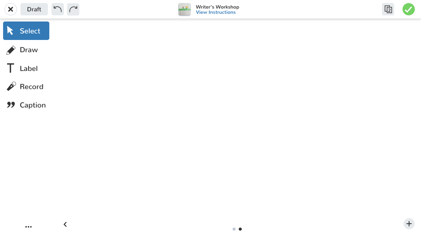
Canvas
The canvas is simple and inviting
Blank canvas that invites the user to complete the most common action (taking a photo, and drawing on top of it)
Most common tools are readily available on the left
Pagination is along the right
Drawing
multiple pen styles
multiple pen widths
choose from a spectrum of colors
Take a photo
Students can upload photos or videos. They can then scale, and rearrange to their liking.
Add Text Labels
Students can add text, change the styling, and choose a background color
Draw, Talk, and Record screen
Students can record their screen while drawing and talking about their work
Take a photo
Students can take a photo (of themselves, or their work)
Add Links
Students can add links to objects on the canvas
Add Voice
Students can add voice labels to any object to further explain their work
Testing
Testing with students presents a unique set of challenges. We faced a lot of difficulty getting feedback before launch, so we tested internally with our employees’ kids. We then launched a limited beta and tested live in classrooms in the San Francisco Bay Area, which we then observed and tweaked based on feedback.
Goals for testing:
Make sure we didn’t break any behavior, gauge excitement for the new tools given that we were changing the entire product that students have come to be so familiar with
Observations and actionable follow up quick iterations
Students were thrilled about all the new updates — especially excited about the new pens
Generally students and teachers just wanted more!
wanted more ability to upload more than just one video and more voice controls
wanted the ability to draw finer details with more pens
Tap targets were a little off and some students struggled with moving things around on the screen, and accidentally scaling at the same time.
new update: introducing a “lock” feature where teachers can lock content on the screen, so the students can’t move it around inadvertently
Key Learnings + Success Metrics
Thinking about this product as a system set us up for success. We’ve since added many features to this product, and still continue to. This was the first time Seesaw approached an update with this in mind, and paved the way for future products to be thought about using this approach.
Bring it back to our users. For first time in a while, we branched away from building for what was working solely for teachers, and built something truly with Students at the core. Because of this, we were able to come up with a product that had Students at the heart, which empowered Teachers in ways we never could have imagined.
At the time, there were about 500,000 student posts on Seesaw to date. Since launch, we have seen growth to over 250,000 posts — in one month!


